When we started the SuiteCRM project three years ago we had only one goal in mind: To create the world’s most powerful, flexible, fully-featured open source CRM.
That took a lot of effort. From the Minimum Viable Product that comprised SugarCRM’s Community Edition, we added Quotes, Products, Contracts, Invoices, Events, Workflow, Reports, Maps, Projects, Portal and Knowledge Base functionality. We also considerably enhanced much of the sub-optimal functionality in Calendars, Campaigns and Cases.
It was iterative. It was very focused. It was hard graft. And it worked. By September 2015, we had won a BOSSIE for the world’s best open source CRM. In the process we knocked SugarCRM off a perch they had occupied since 2005. We had also won our first enterprise contracts with globally scaled corporates. We had competed against SAP, Microsoft, Salesforce and Oracle and we had prevailed.
These projects were all led by IT. The IT people get down and dirty with applications. They are not impressed by Gartner Magic Quadrants. They want to know what it can do, how secure it is, how well it scales, how well structured it is, how maintainable, how viable and how much it costs.
After scrutiny at the highest levels of enterprise computing it becomes apparent that the Emperors Salesforce, Dynamics, SAP etc. really had no clothes. The choice was same-old, same-old vendor lock-in, poor support, huge budgets, long project timescales, sold by lions and delivered by donkeys or greatly reduced project timescales, agile deliveries, fantastic support, no vendor lock-in and project costs that would put Salesforce out of business faster than you can say “commoditised business logic”. Faster, higher quality at dramatically lowered budgets.
So, we had built great software. If there was one thing that we still had to do (actually, there are hundreds of things that we still have to do), one BIG thing, it was the user interface. We had the best application available but it wasn’t pretty. It worked, it was functional, but it didn’t engage, it didn’t put a smile on the face of users.
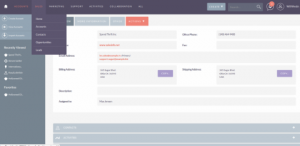
We engaged a design company. They blew us away with their first design. We grabbed it. We ran with it. We innovated hard. We called it Suite P (a Sweet Pea is a rather elegant and fragrant flower) and we nurtured it, grew it, tended it and released it.

Call me a super power user: I’m hardened to CRM. Just give me functionality. Give me a CRM that does what I need it to do. I don’t care what it looks like. I just want it to be powerful, flexible and performant.
That’s what I used to think.
But Suite P. puts a smile on my face when I use SuiteCRM today. It’s beautiful. It’s elegant. I want to marry it and have its children.
My friends get exasperated with me when I declaim their beautiful babies. To me, all newly borns look like a baboon’s backside. Unlike a Baboon’s backside, babies tend to improve with age and blossom into recognisable human forms.
Like all newly borns, Suite P still has a little maturing to do around the edges. Particularly in Search and the email client. We’ll address that in release 7.8, due December 2016.
But I already think Suite P makes SuiteCRM the most beautiful CRM on the planet.
So, now SuiteCRM is the best open source CRM out there, as good as the proprietary vendors and it makes the established vendors look like ugly stepchildren (or Baboon’s backsides if you prefer).
Anyone want to pick a fight with me about it? (a polite, mannered debate is preferable).